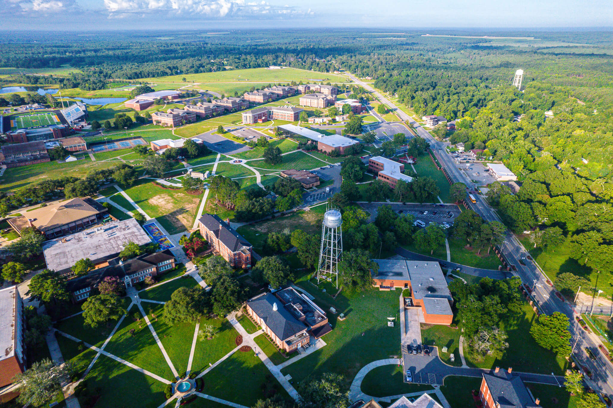
Fort Valley State University
Celebr8 Excellence
#1 Public HBCU in GA For 8 Consecutive Years, U.S. News & World Report 2026 and #1 in Georgia for Social Mobility
FVSU Designated as Carnegie Research Institution
.jpg)
Nursing Receives ACEN Accreditation

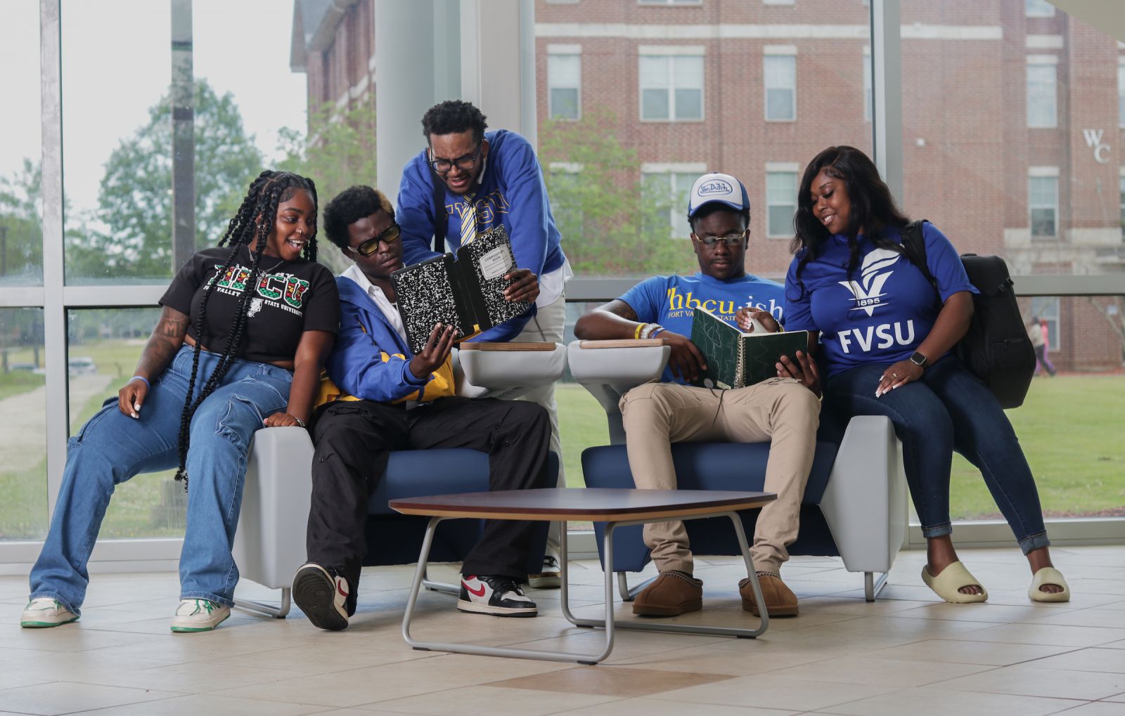
Empower
Your Passion
At Fort Valley State University, we empower students to push the boundaries of what is possible. With our dedicated faculty, state-of-the-art facilities, and innovated programs, we offer our students an unparalleled opportunity to explore their interests and prepare for a fulfilling career.
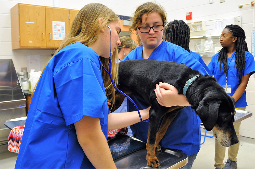
Agriculture
Arts and Sciences
Education
Graduate Studies
Continuing Education
Online Education
This Week
@ FVSU
There's always something happening in Wildcat Nation. View our campus calendar to stay up-to-date with the latest events on and off campus.
Empowering
Educational Dreams
Financial Aid
Higher education is a profound financial commitment. Fort Valley State University is committed to making education accessible to students from all backgrounds.

Scholarships
To support our commitment to accessible and affordable education, Fort Valley State University offers a variety of competition and performance based scholarships.
Work Study
Fort Valley State University offers Federal Work-Study to help students cover a portion of their educational expenses while working on campus.
Excellence Empowers
Success

FVSU leverages its near 128-year tradition of excellence and uniqueness in academic and co-curricular programming to educate students and provide opportunities to engage directly in world-changing research with internationally recognized faculty members tackling complex global challenges.
A Message From
Paul Jones, Ph.D.
10th President
Founded in 1895, Fort Valley State University has a storied history, peopled by graduates that have gone on to impact the world of politics, industry, science and the arts. We provide our students an educational environment where opportunities in experiential learning and hands-on research abound. I invite you to join FVSU and EMPOWER the POSSIBLE.
.jpg)
Recent
News
Fort Valley State University faculty, staff, students and alumni are making headlines! Explore our pressroom and read the latest news from our University community.
.png)
Home
Fort Valley State University Announces Spring 2026 Commencement Speaker
The Honorable Verda M. Colvin, J.D., Supreme Court Justice of Georgia, will serve as FVSU's Commencement speaker for the Spring 2026 ceremony on May 9.

Home
Fort Valley State University Celebrates Academic Excellence at 75th Honors Convocation
FVSU's Honors Convocation recognized and honored students for their outstanding academic achievements and commitment to excellence.
Home
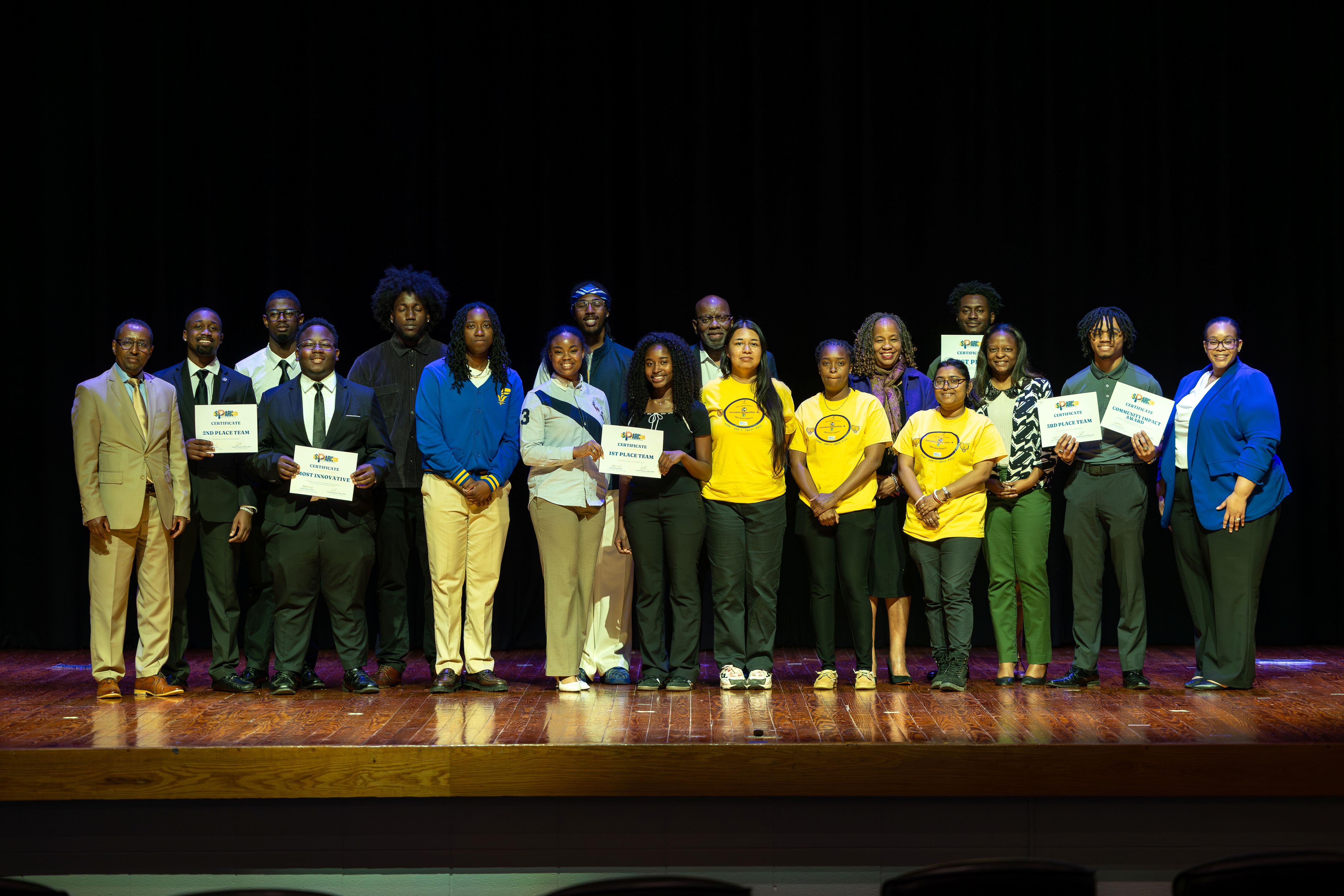
Fort Valley State University Hosts Spark Tank Competition to Select Team for the USG Innovation & Entrepreneurship Challenge
FVSU hosts SparkTank competition to get ready for USG's Innovation and Entrepreneurship Challenge.
Home
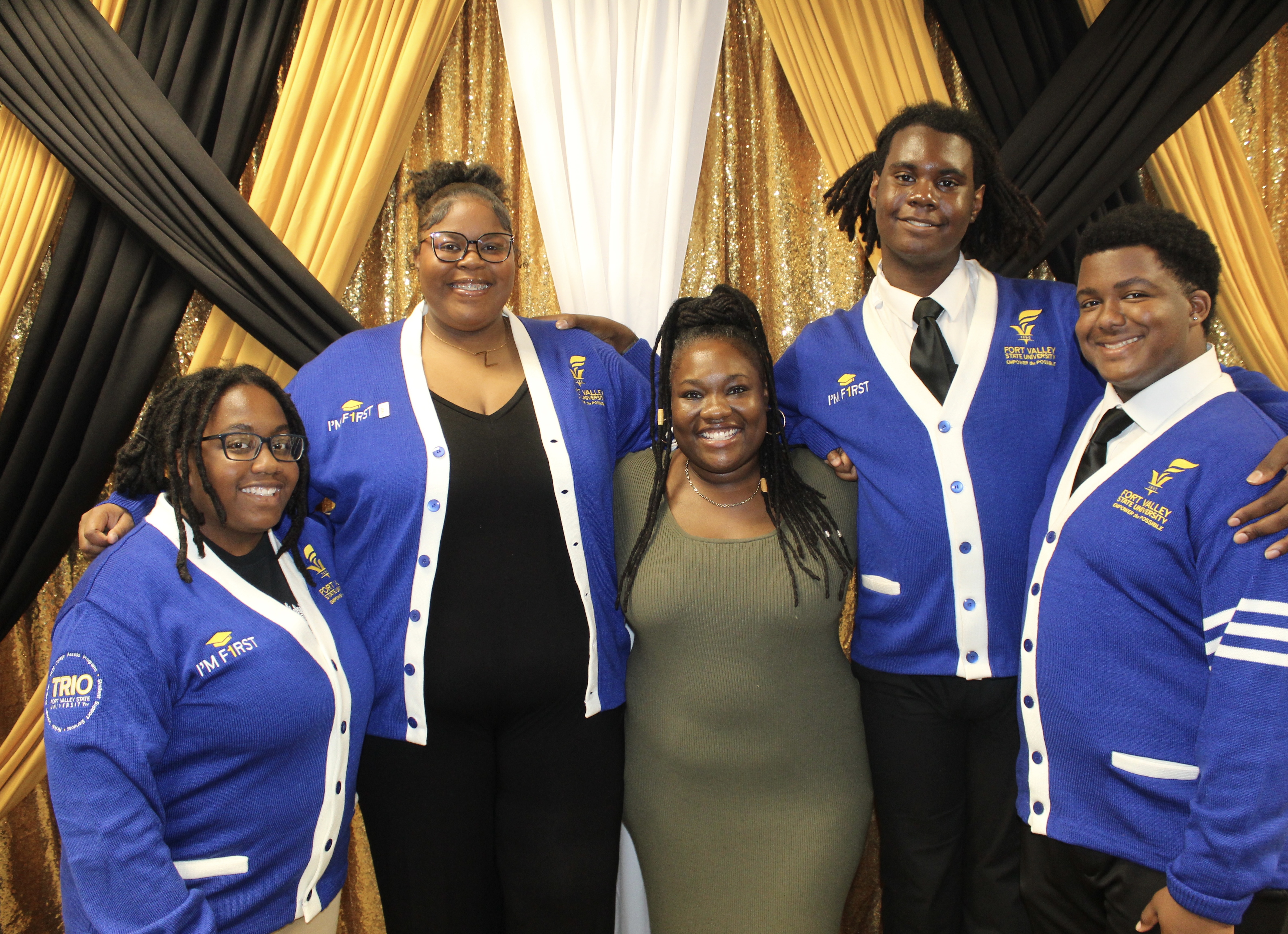
FVSU TRIO Student Support Services Exceeds Federal Performance Objectives for 2024–2025
FVSU TRIO exceeds performance expectations.